At least once a year or so, I try we take time out to pause for a moment and take a look at the current state of digital marketing in the legal sector. Law firms are, after all, one of our principle client types. Every year, competitions like the Webbys and Awwwards crown the ‘best law firm websites.’ In this post, I thought I’d weigh in on some of their decisions.
As the years have rolled along, I’ve seen continual improvement in the legal profession’s adoption of progressive branding, design and strategic practices. I also, though, see a lot of the same mistakes we’ve seen many times before. With little introduction, then, here are some spot observations about some recent law firm websites. Take some time to appreciate them and give a shout out to innovation.
These first three sites were all Webby winners. Although the Webbys only break these down into the ‘law’ category of winners, I’m assigning them more specific categories.
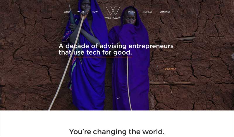
Winner 1: Most Innovative, Thought-Provoking and Almost-But-Not-Quite-Exceeding-Expectations Website: Westaway.
What I Liked.
What I think I like the most about this website is its aspirations to not look like a typical law firm website. You can almost hear the conversations that took place, as this site was conceived. “Look, we’ve got a unique set of legal and consultative services we offer to start-up businesses. We’ve created a targeted ‘package’ of services, intended to cover every legal need at every crucial milestone they’ll face. From incorporation to funding and eventual sale, we know their needs.” This focus on their intended customers extends to the pricing of their services, which are offered as ala carte items, effectively avoiding the unpredictability of hourly billing.
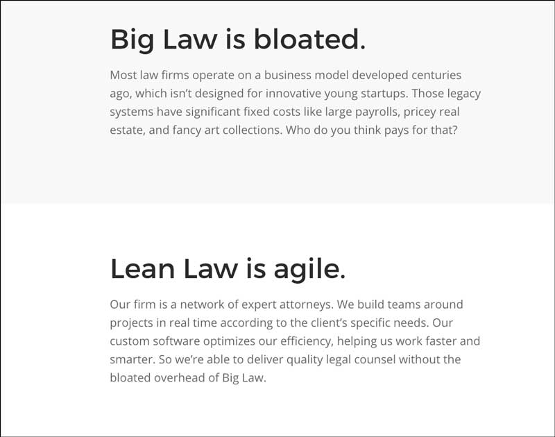
Copywriting on the site is muscular and direct. Instead of the long-winded-but-vacuous copy we so often see on law firm websites, we get strong headlines paired with lean and concise explanations of value propositions. “Big Law is bloated.,” but “Lean Law is Agile.” And we learn the whys and hows of both statements.
What I’m Not Loving So Much.
Unfortunately, a lot of the chutzpah spent on creating a unique site also produced some unsettling reactions. For instance, the full-screen sliders at the top occlude the deeper copy below. This would be fine except, unless you come to the site knowing these guys offer legal services, you might not even guess they’re lawyers.
Moving farther down the page, the copy told me that the firm works with trailblazers. (“A Decade of Entrepreneurs that Disrupt Education,” etc.) And, scrolling farther, that their clients are ‘changing the world.’ And that they ‘offer flat fees.’ It’s not until I’m almost to the bottom of their home page that I learn that they’re ‘disrupting the law.‘ But, even that expression seems a little ambiguous to me. Is ‘disrupting the law’ anything like ‘disturbing the peace?’ Are they practicing the law or breaking it? I’m not totally sure. They would avoid confusion if they added a catchy, descriptive themeline, I think. Maybe something in the first panel of the home page that explained what they do. Something like a pretty line of type that reads ‘legal services powering innovation.’ That would probably be enough.
A Couple Other Kvetches
Moving on from the home page, I had a couple of other quibbles. As a rule, businesses should give full contact information in their footers or contact page. In this case, there isn’t even a phone number. There’s a point at which trying to break a certain corporate cliche begins to erode credibility. As a client, it wouldn’t care that the law firm representing me was in a different location. But I’d still like to know what that location is.
Finally, when I venture to the ‘Who’ part of the website, I’m still a little confused. I learn that the firm’s principal is a well-known advisor to social entrepreneurs. I don’t, however, learn a whole lot else about him, or with whom he works. I’m guessing that the presumption is that his fame precedes him. I probably wouldn’t expect to see detailed biographical information and education credentials on Lady Gaga’s website either.
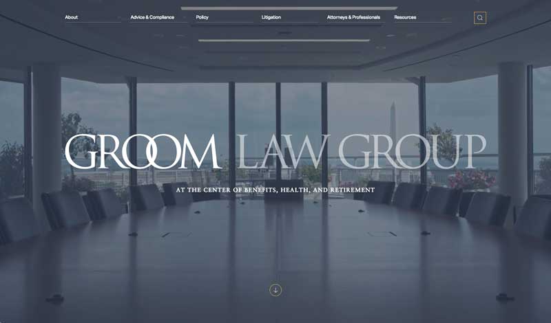
Winner 2: Best Law Firm Website for a Large Firm: The Groom Law Group.
Clean, Classy & Credible
The judges at the Webbys honored this site for good reason. Who’da thunk a firm specializing in healthcare benefits compliance could be so sexy? The homepage succeeds in every conceivable marketing metric. The design is classy, featuring the old-style Sabon serif typeface. The color scheme features deep greys and blues, with orange accents. The messaging is succinct but descriptive. A full-screen video background features a huge, 120-pixel type overlay. The copy reads “Groom Law Group. At the center of benefits, health and retirement.” The refined look of the design is enhanced by the background video, which features the classical monuments of Washington, DC.
The architects clearly understood the referral, business to business nature of the firm. Rather than obvious calls to action, the site respectfully asks its visitors, “What kind of attorney are you looking for?” (As in practice area specialties.) Finally, it’s clear that knowledge helps fuel their sales funnel. Sign-ups for content mailing lists abound.
More Than Just a Homepage
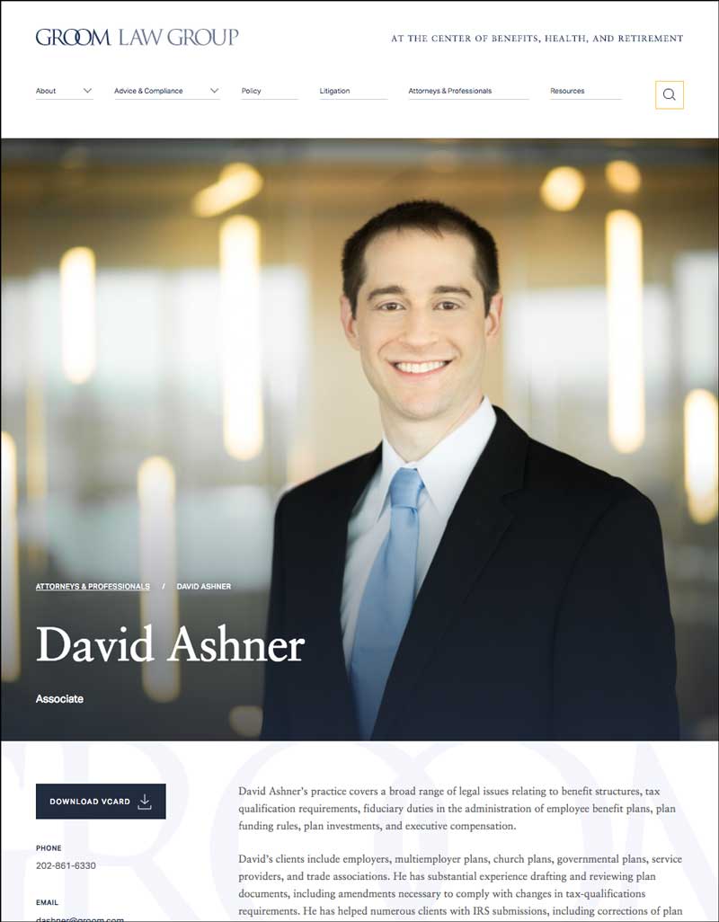
Quality and marketing-savviness don’t break down beyond the home page, either. The Bio section begins with a recognition of their staff’s importance. “Our people are our strength.” It features beautiful, Washingtonian imagery. Copy elements rest on a lovely, typography-enriched background. Each attorney’s bio shot features a soft-focus background. All the essential professional and contact information is there, as well. In short, the content is comprehensive. And none of the attention to detail of the rest of the site is lost.
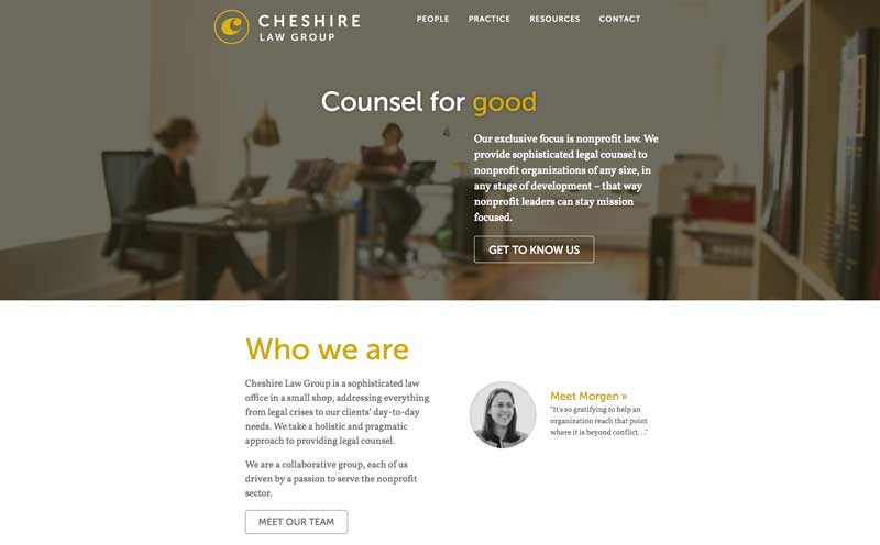
Winner 3 of our “Best Law Firm Websites” List: Best Site for a Small Firm: The Cheshire Law Group.
Small but Beautiful Also Makes our ‘Best Law Firm Websites’ Roundup
This last site is not a 2018 winner. In fact, it’s three years old. But, in a world dominated by expansive big-firm sites, it really stands out. It’s an example of how effective a site built on a limited budget can be. And, for that reason, it should serve as an inspiration to the thousands of just-starting-out boutique law firms.
Once again, the homepage works because it’s clean and immediately gets to a positioning statement. “Our exclusive focus is nonprofit law. We provide sophisticated legal counsel to nonprofit organizations of any size, in any stage of development…” Along with the clear messaging, colors and typography yield a professional but almost whimsical feeling. It’s clear that the partners at this firm enjoy working in the non-profit sphere. The doing-good mentality leads to a feel-good look on the website.
Besides positioning, the homepage also features a quick link to the firm’s founder, as well as a concise services overview. Finally, news and publications from the firm are also featured.
Like our other winners, the site is more than just a pretty homepage. The People section illustrates an understanding of client concerns by addressing a pain point for non-profits: legal fees. Like the Westaway site, attention is paid to ensure clients that their dollars are being spent wisely. The entire People section flows seamlessly from telling the story and philosophy of its partners to detailed, attractive Bio pages. From start to finish, all sections of the site function to create a compelling, relatable sense of the firm’s mission, commitment and value.
Final Thoughts.
“Increasingly, …mass marketing is turning into a mass of niches.” — Chris Anderson
Thinking back to when we began this post, one theme seems to stand out. Sites which recognize internal specialties find it easier to succeed. Positioning statements are much more succinct when your position is clear. And proving your worth through testimonials, verdict amounts, etc, also gets easier. Specialization is all-too-often a point which lawyers refuse to acknowledge. Too many of our clients have tried to pitch themselves as one-stop shops when, really, their expertise and caseloads suggest otherwise. Embracing the gestalt of what your firm reveals a first step towards branding success. And, also, success on the web.