Anyone who knows me, either professionally or personally, knows I walk around downtown Philadelphia a lot. My office is in Philadelphia. My home is in Philadelphia. And a good number of our clients are in Philadelphia. Because of the constant strolls I find myself taking, I’m often noting “ground level” marketing successes and failures, most often in the form of storefront signage and design. I’m also constantly on the prowl for a new place to eat.
Sometimes my vocational and avocational interests collide.
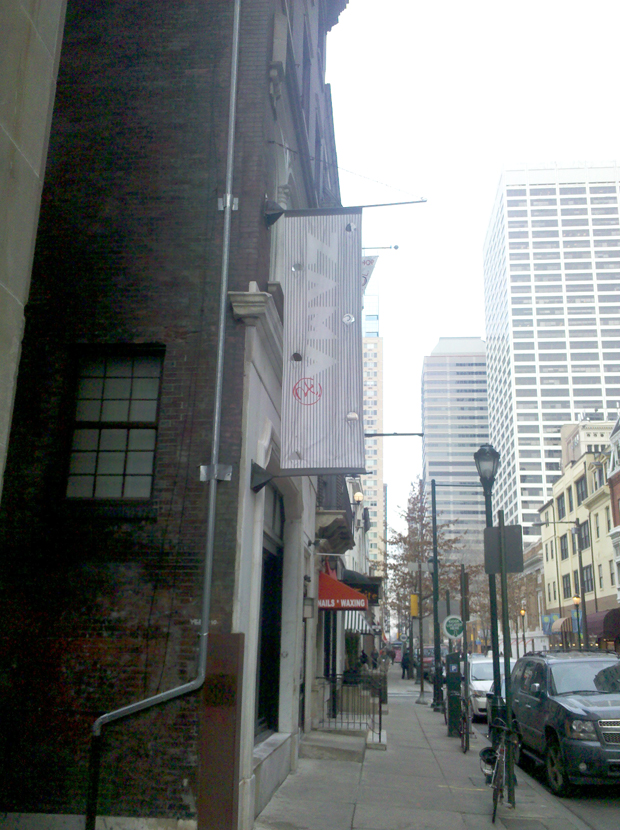
Such was the case the other day, when I came strolling southward down 19th street. As I often do on my strolls, I found myself peering into random storefronts, dodging other pedestrians and, quite possibly, sending a text or two. (Yes, I’m one of those annoying fellow pedestrians you feel like pushing into a mud puddle, as I aimlessly drift into you on the street…) Walking past a particular storefront, I noticed a fully furnished and inviting interior, in a location I thought had been empty until recently. Because it was late afternoon (and there were no diners) and because the first floor is a couple of steps up, off of street level, I found myself slightly disoriented and wasn’t quite sure whether I was looking into a restaurant interior or a spa or some other type of service business. Momentarily confused, I looked up for signage and saw the sign pictured above. Up above me, written in white lettering, which was barely discernible (on a very sunny day) from a grey stripey background, was the one word name of the establishment, Zama. I have to admit, the lettering was so pale, I couldn’t really make out the name and no accompanying verbiage screamed “restaurant!” to me.
Now it turns out Zama is a probably-fantastic sushi restaurant. But I wouldn’t have known that from my first glance at that signage. And, since I wasn’t far enough away to really “read” the exterior-wall signage from my then vantage point, I naturally looked for other signage that might be flush mounted to the wall surface, rather than the ninety degree banner sign. There wasn’t one. As my confusion was peaking, I finally noticed what seemed to be a wall-mounted menu case. “Ah hah!” I thought to myself. “It is indeed a restaurant.” I still wasn’t sure I knew its name, though, so I peered into the menu case, hoping to learn a little more and get the name. Instead, I found this:
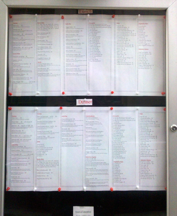
In case you don’t notice this immediately, the name of the place is nowhere to be found on either the menu or the case. Although I had figured out that the storefront I’d stumbled upon was a sushi place, it was only when I closely inspected the banner sign that I figured everything out. And, if I had not been exceptionally curious, and willing to waste a few moments of my time, all knowledge of their being an interesting new sushi place on this block would have completely escaped my notice.
There are lessons to be learned here. What’s astonishing to me, though, is that anyone needs to “learn” lessons which seem so obvious. In the world of storefront signage, a couple of design axioms seem pretty clear.
-
Value prominence over subtlety.
That white-on-light-grey type treatment might be classy, but it doesn’t fly for the “must-recognize-instantly-or-you’ve failed” world of streetscape advertising.
-
Some explanation of type-of-business might be nice.
After some research, I learned that this particular restaurant is actually named after the well-known chef who opened it. That’s interesting to know but, again, I shouldn’t have to get home and do a Google search to figure out that I had actually passed a great sushi restaurant
-
Make sure signage runs both parallel and at ninety degrees to the storefront.
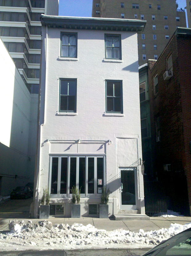
This one relates to my own walking experiences. Basically, if you’re walking towards or away from the building, projecting signage mounted at ninety degrees to the wall surface is perfectly fine. But try reading that signage when you’re immediately across the street from the establishment or right in front of it. If you’re directly across from that signage, it’s basically illegible. (See the example below, for instance, which is a well-known Italian restaurant in the Rittenhouse area, Caffe Casta Diva.) Only wall mounted signage which runs parallel to the building storefront is legible in these circumstances, which is why I think smart signage design should feature both.
Would You Know the Name of This Restaurant if You Were Walking By?
Would You Know That This Storefront is One of Philadelphia’s Better Known Italian BYOBs?
So, I’ve said enough about all this for now. This column seems to be much more about commonsense than about making great observations about design or marketing. But, as my strolls around town prove time and again, even the basics frequently get overlooked.