
Some thoughts on how to summarily ignore the design and development trends of today and build a truly awful website in 2017.
I have to admit: when I sat down to write this post, I was inclined to write the topical ‘website design trends of 2017’ post which seems like an apt post at this time of the year. I did my research, and, as I typically discover when I sit down to write something which others have already identified as low hanging fruit in the orchard of content creation, I discovered that:
- There were already a bunch of blog posts out there. See this one or this one if you want to see a couple of the better ones relating to website development.
- For the most part, folks were making the same points, so anything I might have to add would largely echo observations others have already made.
- A lot of the predictions of 2017 seem, well, not very forward thinking at all. As I read through the list of ’emerging’ trends in web design for 2017, for instance, I encountered a lot of very familiar sounding terms. For 2017, for instance, I found that some of the most popular themes (in no particular order) emerging for the year were going to be:
- semi-flat design
- minimalism
- the use of big, bold typography and
- more animation.
Interestingly, I did search on ‘popular website design trends for 2015’ and found that year’s trendsetters to include: (ahem)
- flat design
- minimalism
- the use of big, bold typography and
- more animation.
While it’s true that there were some nuanced differences between the two lists – flat design, for instance has evolved into semi-flat design – the lists are largely similar.
So, with 2017 shaping up to be a year of incremental evolution in web design, rather than wholesale revolution, maybe there’s a more interesting post to write, namely what shouldn’t we be doing in 2017? Which brings me to the theme of this post.
Five rules for designing an epically horrible website in 2017.
Website Development Rule #1: Ignore Resolution and Device Independent Design

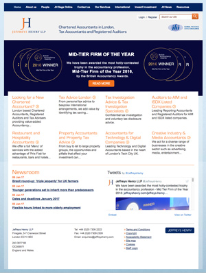
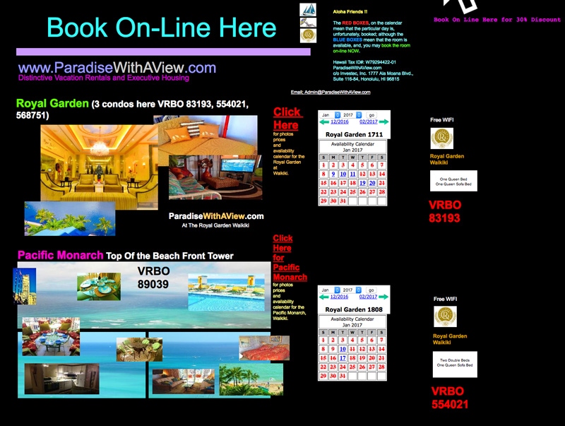
The most important trend in website design in the last five years or so has reflected the adoption of mobile devices to peruse the web. So, then, to really distinguish yourself from the crowd of decent websites out there, and stand out as truly horrible, you’ll need to ignore that. Pretend when your designing this website that we still live in the age where desktop search dominates. Never mind that Google says otherwise.Here’s an example of a large UK law firm that’s made no effort to make their website functional on mobile. As you can see from the two screenshots, the site looks fine on desktop (see image above) but try reading the exact same layout on a phone (smaller image.) This is how to really make your users eyes’ scream.
Website Development Rule #2: Ignore everything Google says, especially about AMP.
Late in 2015, Google announced its new open source standard for optimizing websites for speed, called AMP. Basically, AMP, as Google explains, “aims to dramatically improve the performance of the mobile web. We want webpages with rich content… to work alongside smart ads, and to load instantaneously. We also want the same code to work across multiple platforms and devices so that content can appear everywhere in an instant—no matter what type of phone, tablet or mobile device you’re using.” AMP is a software framework which uses a few unique tags and structures which are integrated into your site’s existing HTML. We made our own website AMP compliant last year.
So, even though Google is now favoring AMP compliance, a truly awful site needs no traffic so, our advice is to just ignore AMP completely. (In the event that traffic and search rank happen to be important though, feel free to reach out to these guys. They really know what they’re doing.)
Website Development Rule #3: Design a home page that’s cluttered, filled with multiple colors and features fonts in an array of sizes.
Are tidy, clean websites with beautiful images and lean copywriting getting you down? Spice up your site with dark backgrounds, a cornupcopia of pretty colors and type of all different sizes. Sure, Google feels so strongly about simplicity and user experience that it has invested vast resources to create the Material Design project and library but, who really cares? Remember, awfulness is our Holy Grail.
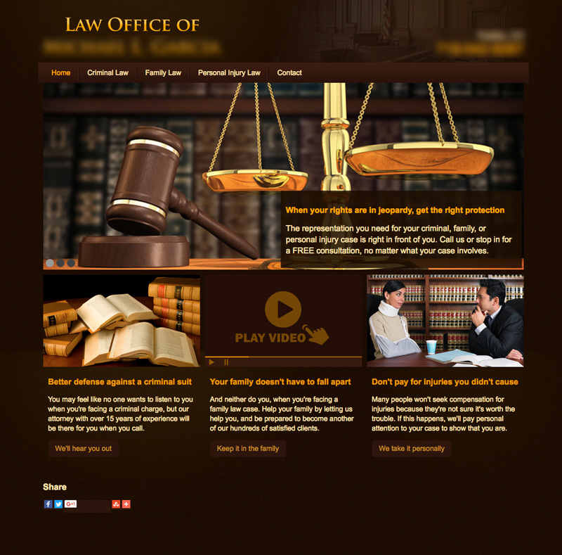
Website Development Rule #4: Make sure your site uses lots of clichéd stock photography.
Nothing says “I’m a lawyer” more than gavels, courtrooms and law books, right? Too bad that folks got sick of looking at these tired old war horses from the moment in 2001 when someone at iStock added them to their catalog. Use them and you’ll be sure to get your point across in a ham-handed, direct way. Of course you’ll also be broadcasting the fact that you put no original thinking into the design of your site (which might translate to the assumption that you’re equally uninspired as an attorney) but we’re not trying to seem inventive here, right? We’re trying to build a lousy site.
Website Development Rule #5: Don’t believe that storytelling crap.
 Storytelling, according to the stories being told by the pundits, is in. Storytelling is nothing new to the world of branding, but bringing the technique to the web is getting a lot of attention these days. The idea is to tell your brand or firm’s story through some sort of narrative which, often, invites the user to participate as a character. These guys think they can tell you how to do it in this guide. But don’t listen to them. Making your site’s visitors part of a story engages them and connects them with your brand or service. But, remember, our goal is to build a lousy website so why would we want to engage or otherwise personalize a visitation experience? Our advice? Make sure you ignore all that mularkey. Don’t tell your site visitors what you do or personalize the experience by letting them understand better how you can help them. Getting to know your business is their job, not yours, right?
Wrapping it all up.
Knowing what all those hoity–toity “thought leaders” in website design are doing makes for a perfect road map for what not to do to ensure your new website is not just bad but truly horrific. If failure is your goal, you’d do well to follow the steps outlined here. Oh, and, if by chance you’re looking for other, more progressive answers, give us a shout.
Resources
Post Navigation
Subscribe to Sitegeist
Subscribe and receive timely, strategic advice on what's trending in
digital development, design, and marketing.