As working web professionals, we’re faced with walking a tightrope of information and explanation everyday. Basically, what we do is technical by nature. But, it has very real ramifications in the daily lives of our (usually) non-technical clients. One of our core tasks in the studio, then, is attempting to clarify how the technical minutiae of the web can affect things like user experience, conversion rates and other things of value to our customers.
In this spirit, then, of debabelizing the arcane language of the web, I thought it would be fun to take a look at some of the emerging specifications in HTML, CSS & JavaScript (the programming languages of the browser), which will potentially change the way we use the web in the very near future.
Technology #1: Regions
Regions are an in-progress specification for CSS. Regions already have support in the latest versions of IOS based versions of Safari and Internet Explorer.
What do they do? The official write-up of the regions specification describes things this way:
“The CSS Regions module allows content from one or more elements to flow through one or more boxes called CSS Regions…”
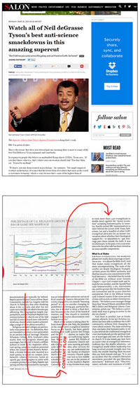
Translated, this implies some really cool layout-related stuff which will add flexibility to pages and apps which was previously lacking. Consider, for a moment, the way an editorial website like Salon typically features its articles. In the screenshot below, the user’s page is divided into two columns. Content is featured on the left, ads or other secondary items on the right. An image will anchor the top of the page and, if further images are buried in the text, their position is fixed, relative to the text content.
In other words, images in standard mark-up are immovable objects and the content above and below them can’t flow from container contents above to container contents below.
Compare this layout paradigm, though, to what we find in print. In the scan below, for instance, see how content flows seamlessly from column to column. (Image credit.)
That’s exactly what the Regions specification will allow us to do, moving forward. No longer will we need to flow text in single-columns but, rather, we’ll be able to embrace (if we desire) visual formats which have long existed in the world of editorial print media.
Additionally, we’ll be able to free content to move above and below image elements, in response to changing device resolution. For those of you reading this on a recent Mac or Windows 8+ machine, check out this. In this experimental article, created for The National Geographic, text flows above and below each image changes, according to resolution. This flexibility, combined with the now standard techniques used in Responsive Design, will allow for even greater flexibility for layout, across a variety of platforms.
Next technology up: Flexbox